petite_madame (![[personal profile]](https://www.dreamwidth.org/img/silk/identity/user.png) petite_madame) wrote2010-07-04 06:05 am
petite_madame) wrote2010-07-04 06:05 am
Entry tags:
THE BIG FOOTBALL POST : Next Man Up Illustration Arts - 10 FAN ARTS

LET'S START
What's the concept ?All the fan arts below are illustration arts for a fan fiction by
Next Man Up
Adult, Jared/Jensen, Jared/Sandy
~97,500 words
Armed with strength, size and instinctive talent, Jared Padalecki is the first round draft pick for the faltering Dallas Cowboys. Quickly granted a multi-million dollar contract and heralded as the hopeful future franchise quarterback, Jared is thrilled to be a part of the team he grew up idolizing and is all too eager to take the next step in what should be a long and promising career. However, Jared soon realizes he has a much tougher road ahead than anticipated when he meets the prickly Jensen Ackles, the team's veteran QB and Jared's number one competitor for the starting roster spot.
In a league ruled by money, celebrity and ego, where the roster changes week to week and injuries aren't so much a risk as a fact of life, Jared must prove himself capable of leading one of the NFL's most glamorous and controversial teams back to glory. And in the process, must deal with his teammates' potentially career-ending secrets and his own burgeoning, confusing relationship with Ackles.
- Link to Next Man Up Master Post : timewillbe.livejournal.com/24444.html
- Link to NMU Timestamp #1 : timewillbe.livejournal.com/27361.html
- Link to NMU Timestamps #2 : timewillbe.livejournal.com/30716.html
Isn't there a fic a little bit like this one, with football players and the Dallas CB in this year's BB ? It sounds familiar...
You are absolutely right. It's called Hail Mary and if it reminds you of Next Man Up it's because it's the sequel! Here's a summary and a link to the Master Post (taken from rhythmsextion's LJ) :
Three years since becoming the first openly gay coach of a Division I collegiate football team, Jensen Ackles is hired by the Dallas Cowboys as their new quarterbacks coach. Though happy to return to his hometown and eager to return to the NFL, Jensen's new position puts him directly in charge of former teammate, Jared Padalecki, with whom Jensen had a somewhat complicated personal relationship ten years before. Jensen also finds his new position comes with a price when the organization makes it clear they intend to use Jensen's sexual orientation to further their own status. When an old high school friend steps back into Jensen's life, the situation becomes increasingly complicated as Jensen struggles to balance his professional life with his private while attempting to control his reawakening feelings for Padalecki.
Link to Hail Mary Master Post : timewillbe.livejournal.com/37818.html
Are you the only fan artist who have worked on Next Man Up ?
Absolutely no!! Two great artists have worked on illustration arts for this story,


FROM ONE TO TEN : THE ARTS
ONE : Next Man Up Poster Art

Full size version available here : img251.imageshack.us/img251/7581/47253460.jpg
What's the concept ?
Here's typically the kind of fan art that started in a very simple way and got completely out of hand. At the beginning, it should have been a portrait of Jared and only of Jared. I don't know why I added Jensen at the back, just to see the result and as it turned out ok, I finished the portrait to the last details. However, with only two characters, the composition of the image was really strange. And then came Chad.
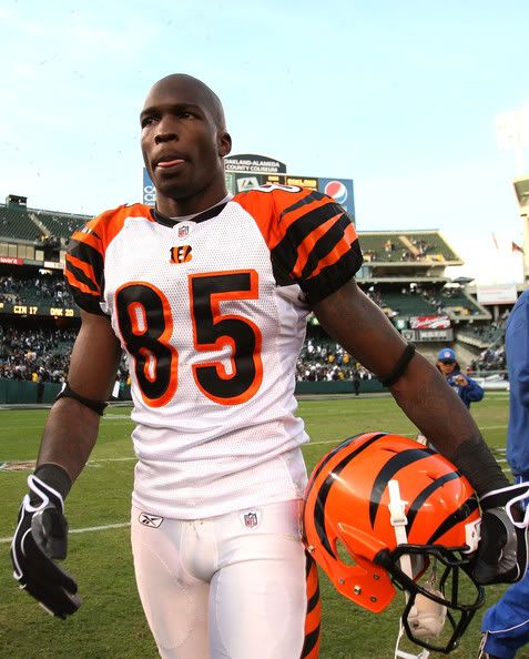
 Something was still missing. It wasn't a question of composition this time, it was a question of colors : too much blue... I finally came up with the idea to add Chris and his red uniform, to compose the image as a kind of movie poster with a gradient palette going from red to blue with white touches that would remind the viewer the American flag. 35 hours, 15 nervous breakdowns, 200 Coca Cola cans and a long hunt to find the right CMM reference pic later, the "NMU super production" finally got its poster.
 For once, I drew all the characters on the same document (I usually don't work like that) and it lead to a drawing that was a monster size wise (about 6500 px X 4300 px) that I had to reduce at the end because Photoshop, like the French soccer team during the World Cup was threatening to go on strike...

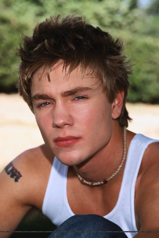
Reference pictures : Jared - Jensen - Chad - Chris
Photoshop CS - Painter Essential 3
TWO - Next Man Up Preview Gif

What's the concept ?
Basically, having fun with Image Ready. Image Ready is a very simple software from the Adobe suite that helps you create in just a few steps gif animations. Here, there are only 6 layers (4 for the hair, 2 for the rain) and 4 animation steps set to a 0,2 second speed. As I told you above, the big "NMU poster art" was aimed to be a Jared fan art and a Jared fan art only. This is what the drawing was looking like before I lost control of the situation. The idea of turning it into a gif came up

Reference picture : Jared
Photoshop CS - Painter Essential 3 - Image Ready
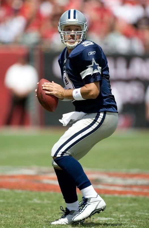
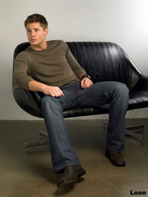
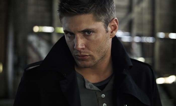
THREE - The quarterback : Jensen

Full size version available here : img153.imageshack.us/img153/4750/73219092.jpg
What's the concept ?
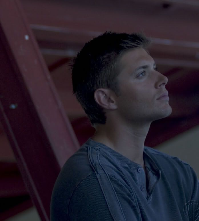
In the story, Jensen is the #13 of the Dallas Cowboys. Here is the guy in the heat of the action during a training with the other players on the field. I wanted something very dynamic that really shows that the character was in motion. I used mainly Painter and its fantastic Digital Watercolor tool to create that effect. I also added a "motion blur" with Photoshop in the background and reworked the image with the Photoshop Dry Brush. I worked really fast for that one, around 15 hours I think (yes folks, it's fast!
) because I had the right reference pictures, the pose wasn't difficult and for once because of the motion effect, I didn't have to take care of very very small details like I usually do. As far as the face is concerned, I drew it alone on a separate document (because it's impossible to draw a face that small with so many details), resized it and added it later on Jensen's body. Shouldn't he wear a helmet or something like that to protect him ?
I think he should...But let's face the truth...Did you really want me to hide Jensen's face under a helmet ? Hum ? Ok ladies, problem solved!

Reference pictures : Tony Romo - Jensen
Photoshop CS - Painter Essential 3 - Paint Shop Pro
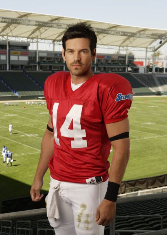
FOUR - The quarterback : Jared

Full size version : img704.imageshack.us/img704/8233/21071782.jpg
What's the concept ?
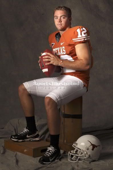
In Next Man Up, Jared, like Jensen is one the quarterbacks of the team. At the beginning, the drawing shouldn't have looked like this one at all (as you can see below if you check out fan art #5). The guy should have been in the Dallas CB locker room but I finally changed my mind at the last minute and drew him with the original background of the reference picture because after all, it was just perfect, no need to sophisticate! I wanted to change from what I usually do in terms of illustration that is too say using mainly the Photoshop Basic brushes set and the Painter Digital watercolor tool. For once, I went for the Photoshop Dry Brushes coupled with the Painter Art Pen tool to give the impression the drawing was executed in chalks and pastels. I added a texture to add to the "grunge" effect of the image et voila!
Reference pictures : Eddie Cibrian - Jared
Photoshop CS - Painter Essential 3 - Paint Shop Pro
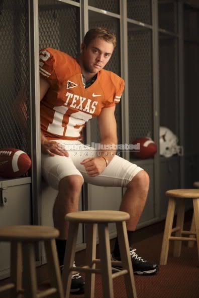
FIVE - Outtake : The quarterback : Jared

Full size version available here : img685.imageshack.us/img685/1459/jaredqbsketchlj.jpg
What's the concept ?
Jared, the #14 of the Dallas CB in the locker room after a game. This illustration is the first version of the fan art above and yes, the two have practically nothing in common except for the pose. The technique I used, the face, the background, everything is different. This is typically the way I work : I start with an idea, draw a sketch, think it's awesome then it's awful, and finally change everything once scanned and colored in Photoshop
. Here, however, I liked how the original B&W version came out so I decided to keep it and reworked it with Photoshop and Painter. And as )For the Photoshop geeks...
A little step by step...

Don't think that because you used traditional medium like pencils and charcoal you just have to scan the picture and...voilà, everything will be perfect ! Digital tools like Painter and Photoshop are a great help when it comes to enhance the shadows and highlights, correct some mistakes and even rework the face. Here's an example below, before and after the black shadows (added with Painter Digital Watercolor tool and one of Photoshop default brush) and the white highlights. I also added at the end sweat drops because

On the left, the face looks almost flat. I didn't dare to add too many shadows when I worked with the pencil so I reworked Jared's features with Painter first then with Photoshop (with a layer set to "Multiply"), it gives a better control as you can draw and erase as many times as you want.
Reference photos : Eddie Cibrian - Jared - Locker Room
Pencil, charcoal, make up (!) - Photoshop CS - Painter Essential 3.
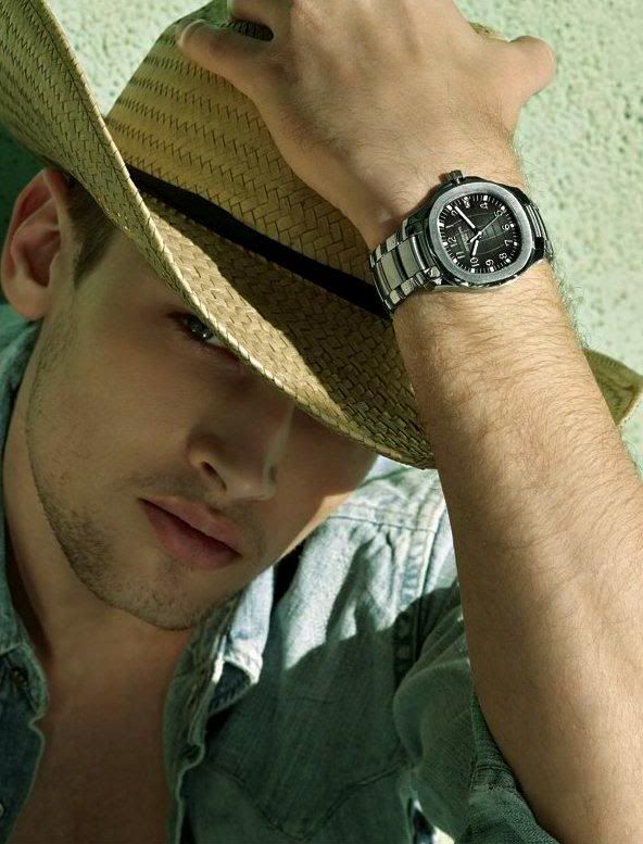
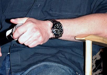
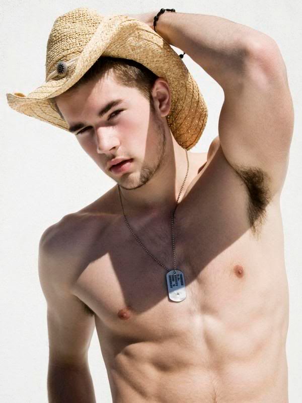
SIX - The boy from Texas : Jensen

Full size version available here : img822.imageshack.us/img822/2096/45326496.jpg
What's the concept ?
I got the idea for this one after I stumbled upon a photo on
The watch Jensen is wearing on the picture is really his watch. Call me a detail freak but I took as a reference photo a photo from a con and copied his watch and not the one the boy with the cowboy hat wore in the original picture. In addition, it looks better and add to the "realism" of the RPS story.
For the Photoshop geeks...
Here's the drawing after the scanning and Painter (left) and with all the Photoshop retouches on the right (textures + shadows + white highlights). I just love traditional art but I think that's it's even better with a little help from CG softwares.


Reference pictures : Boy with the cowboy hat (Thanks
Pencil, charcoal - Photoshop CS - Painter Essential 3
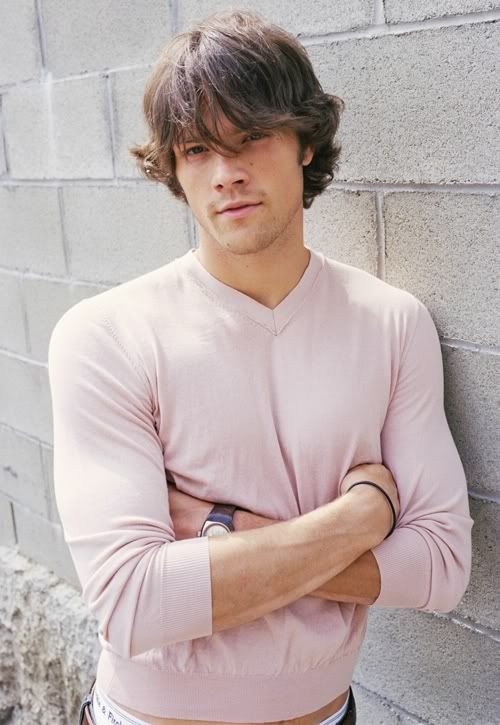
SEVEN - Jared

Full size version available here : img42.imageshack.us/img42/998/cblj.jpg
What's the concept ?
J-A-R-E-D W-I-T-H-O-U-T A S-H-I-R-T
Do you really need a concept here ?
Ok, sometimes, fic authors write PWP and fan artists do (how can we call it ?) FAWAC (fan arts without a concept), just for the pleasure to draw stuff like that. It doesn't take less time, it just takes a little bit less originality and let's face it, it's a lot of fun.
Reference pictures : man with cowboy hat - Jared
Pencil - Charcoal - Photoshop CS - Painter Essential 3
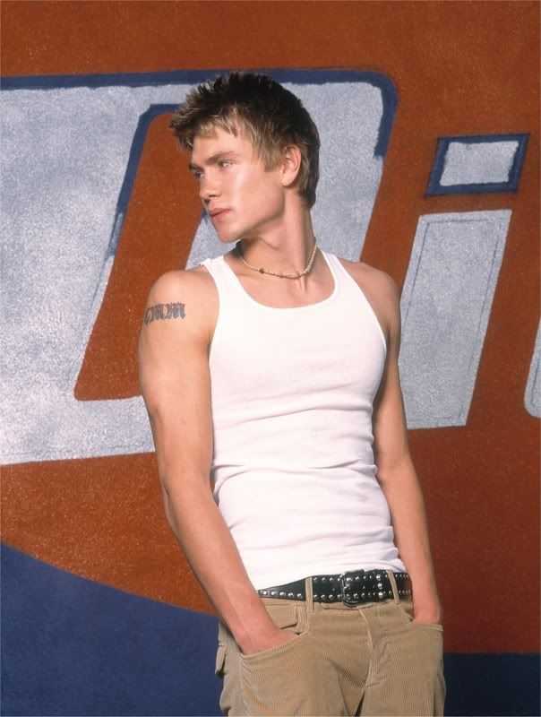
EIGHT - Dallas CB - Denver Broncos 24-38 (Chad)

Full size version available here : img16.imageshack.us/img16/2610/33278160.jpg
What's the concept ?
As I said once to
I didn't plan at all to draw a Chad fan art because to tell you the truth, I've never watched in my life a show with CMM ( = I am not a fan) but after reading the story again to draw my illustration arts I thought that maybe paying a tribute to the guy wasn't a bad idea. In the first draft, Chad was sitting on a bench holding his helmet between his hands. Then, IDK why, I thought about a very famous football player, sorry, soccer player for you, Eric Cantona a.k.a The King Eric who had the habit to always be in a very bad mood and leave the field without talking to the press. This kind of behavior being "very Chad", I changed the whole picture to reach the result you can see now, Chad leaving the field, ready to throw his helmet to the face of the first person who would talk to him.
For the Photoshop geeks...
OMG Petite-Madame, you used the lens flare ?!!!
Yes, I did, the "effect of death" as I like to call it.
Sorry folks but for me it's the worst effect available in PS (with "Crosshatches" ) . I don't use it very often, I think that over 200 fan arts of everything and anything I might have used it 5 times...Here, I needed it to create the sun but I lowered the opacity of the halo so that it was VERY subtle, almost invisible and erased most of the circles of light created by the lens flare.Textures, filters ?
They are really important in this drawing. It's thanks to them that I could create the sunset effect. I used a "warming filter", changed the tones of the picture thanks to the color balance ("more yellow" + "more magenta") and finally added a sepia texture (to a low opacity, around 20%) with the Stamp Tool set to "Multiply". And let's not forget the lens flare.

Reference pictures : Football player - Chad
Painter Essential Pro - Photoshop CS
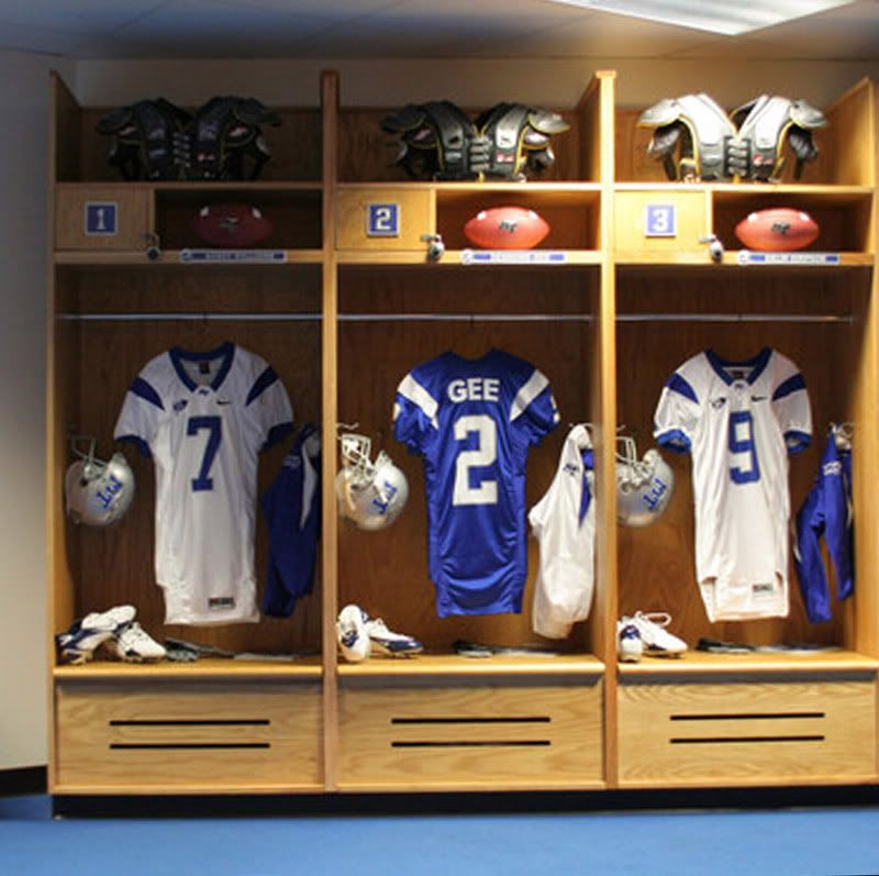
NINE - The Locker Room : Jared & Jensen

Full size version available here : img23.imageshack.us/img23/7240/62669370.jpg
What's the concept ?
After I finished one of my pieces called Winchesters' Laundry Day, I swore I would never spend so much time again on a fan art because at the end I was really exhausted and stayed without drawing during at least 3 or 4 days (which is for me something absolutely unthinkable...). I was far from thinking I would not only do it again but that I would also break the preceding record concerning the time spent on one drawing with....45 hours! Yeaaaah!! (I know, I am nuts but why not ?). I loved the idea of Jared & Jensen talking in the locker room after a game but I didn't think it would be that complicated. FTR, I don't think I would have started if I knew where that drawing was going..
At the beginning, the guys had their blue uniforms but when
For the Photoshop geeks...
Technically speaking, it was very close to the "Laundromat" fan art meaning it was impossible for me to draw properly Jensen's & Jared's faces at such a small scale, I am not like those Chinese artists who are able to reproduce a whole landscape on a grain of rice. I had to draw on a separate document the boys' faces, then add them to the main picture and finally rework them with Painter and Photoshop to avoid the "head pasted-on effect". So what you have in front of you is in fact a patchwork of 3 pieces (2 heads + the main picture).
Did you paint over a part of the picture ?
I painted over a part of the locker room behind Jared, the one above the shirts (with the balls and the protection equipment). I also re-used from my Chad fan art the helmet on the floor..
Here's a recap of how the picture was built :

Reference pictures : Football player 1 - Football player 2 - Jared - Jensen - Locker room
Photoshop CS - Painter Essential
TEN - The End - Jensen
This fan arts is completely spoilery so don't click on it if you didn't read NMU yet. There are the last lines of the Timestamp #2 written all over it so if you don't want to be spoiled , click on the "Non-Book version" below.
Book version : WITH THE TEXT

Full size version available here : img153.imageshack.us/img153/160/24142143.jpg
Non-Book version (Non-spoilery) :

Full size version available here : img709.imageshack.us/img709/6791/33877576.jpg
*SPOILER* (Do not read if you don't want to be spoiled!!!)
What's the concept ?
At the end of the Timestamp #2, Jensen's career has reached an all time low and the guy who was once the Dallas CB QB decides to finally quit, a decision unavoidable after a series of bad performances and a severe injury. Even, if in the story Jensen doesn't end up his career with the Dallas CB, I really wanted to draw him with this uniform and also show how much he was fed up and ready to leave everything behind him.
In a first version, Jensen wasn't alone in the picture : Coach Morgan (Jeffrey) was next to him but I erased him pretty quickly because I thought it distracted the viewer's attention from what was the most important : Jensen. I also started to work on a color version but it was really far more powerful in terms of intensity and conveyed less angst so I reworked the B&W sketch to add a sepia texture and shadows (Painter) and also added a LOT of details to Jensen's face thanks to Photoshop.
When I worked on the sketch, I was looking for a good way to texturize the floor so I put the piece of paper against the wall of my apartment and started to draw directly against the wall to make the texture underneath appear on the sheet : the texture you can see near Jensen's feet isn't a Photoshop texture : it's my wallpaper
Reference pictures : Sorry, I lost the main one, it came from a movie about football - Jensen
*****************************
At the end what was the most difficult ?
- I suffer from (light) dyslexia so writing the name R-H-Y-T-H-M-S-E-X-T-I-O-N without any mistake was a real challenge (and I am not kidding...I had to rework two of my drawings because the name wasn't written properly
) . If you are not dyslexic yourself you won't understand, if you are, give it a shot, I am sure it will make you laugh...eventually! - The "locker room" fan art almost drove me nuts, but I am glad I found the courage to finish it

- CMM 's mouth. Beautiful lips but really difficult to draw

***************************************
Well I think we can call it a day!!
A big thanks to

I hope you enjoyed this post!!
I will be out of LJ during at least a month (or a little bit more), except for a rec', I am going back to my hometown for the summer. Paris, here I am !!!

GOOD BYE!!!!!
Next illustration arts : The Doors of Time by
Next Supernatural fan art : The one who gripped you tight and raised you from perdition (A little bit gross, bloody and disturbing but a lot of fun to draw so far)
Page 2 of 4