Fan Art : Jensen - Smoke & Lightning (The City of Angels)

The full size version is available here : http://img695.imageshack.us/img695/7646/cityofangelslj.jpg
GENERAL QUESTIONS
What's the concept ?
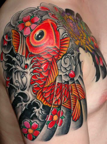
This is an illustration art for an AU RPF called Smoke and Lightning, Book III - The City Of Angels, written by Misses Bloodyadorable and EvilTwin. In this story, Jensen is a doctor so here's the guy after a day at work. And yes, he has a full sleeve tattoo on his arm. If you know a Md like this one, just give me the address of the hospital...
If you want to know more about Smoke and Lightning you can check :
1) The fic master posts :
- Book One (Complete) : http://community.livejournal.com/arealwildchild/9553.html
- Book Two (Complete) : http://community.livejournal.com/arealwildchild/27680.html
- Book Three (In Progress) : http://community.livejournal.com/arealwildchild/52119.html
2) Bloodyadorable's great photomanips on her Deviant Art page here :
http://bloodyadorable.deviantart.com/
3) My previous post devoted to a Jared- Smoke and Lightning fan art here : http://petite-madame.livejournal.com/1864.html
You will learn more about the story and why you should start reading particularly if you love bad boys with bikes and tattoos ;)
Ok, this is Jensen as he is described in the fic but he has something of...Dean, no ?
Actually yes..I can't explain exactly the reasons why. The general aura maybe, the moody attitude or just because of the reference picture I used. I think I am going to transform this fan art into a "Dean version" with a zombie or something which shows up behind the window and Dean holding a smoking gun. It's gonna be a lot of fun!! ^o^
Oh no...zombies again, you can't help it, can't you ?
No I can't...Next time, it's gonna be bloody. Two Spn fan arts one after the other without even one drop of blood is enough even if I really enjoyed creating those two pieces for S&L.
Funniest thing to draw ?
Even if 50% of it was a paintover (see below) the tattoo was a lot of fun to create. I really love the final result ^^
Most boring ?
The town. One day, like famous mangakas in Japan, I will have an army of slaves I will treat like shit and who will be paid only to draw sets and "mechas" such as cars (except the Impala), washing machines, guitars...Until then, I have to draw everything myself...
LET'S TALK ABOUT TECHNIQUE
What softwares did you use ?
Photoshop CS and Painter Essential 3, no Paint ProShop this time.
Tablet : Wacom Graphire 4
How long did it take you ?
More than 20 hours for that one I think, mainly because I am nuts enough to have created a whole town hidden behind a window...
OMG, 20 hours for a fan art..Don't you have a life or something ?
I do have a life but unfortunately for me I am a bit of an insomniac. I just can't sleep at night, sleeping 3 hours is already a lot for me. So I have two solutions :
1) Hanging out with the owls in the streets of Tokyo...Awesome...

2) Drawing, everything and anything, fan arts, comic strips, cute stuff, stupid self portraits, just to pass the time. That's more creative than staying in front of the TV watching Japanese TV shows where a guy pours boiling water on an another guy's butt.
What brushes did you use ?
Photoshop : Mainly default brushes from the "basic brushes set" (Opacity 30%-50%), a "dry brush" for the shadows and outlines plus a whole bunch of brushes downloaded on the net. Once again, I can't give you a precise link for every brush because I downloaded them ages ago but you can find very good stuff on websites such as Brusheezy or Deviant Art. However, here is a little glimpse at the main brushes I used in my drawing :

Painter : Acrylics, chalks and digital watercolors with a very low opacity.
Because Jensen is hot but Jensen with a tattoo is even hotter : creating the tattoo
In my latest fan art which was also an illustration art for Smoke and Lightning, I used a different method to create the tattoos : I used predefined brushes and added colors (See Let's talk about technique in my previous post, at the bottom of the page).
This time, I wanted more realism so I used a mix of paintover and predefined brushes. I used this reference picture from an existing tattoo, added the fish and the bottom of the tattoo on Jensen's arm thanks to the "Stamp tool" (with a layer set to "Multiply" with an opacity of 80%) and thanks to a predefined brush (see above), I "drew" the flower (in two clicks, ho, ho, ho ^^) next to the koi. I added some colors, highlights (mainly in pale blue), redrew some parts to give the impression it was one tattoo and not a patchwork of various sources et voilà!
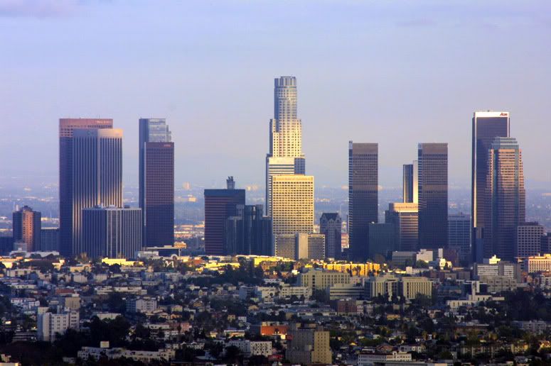
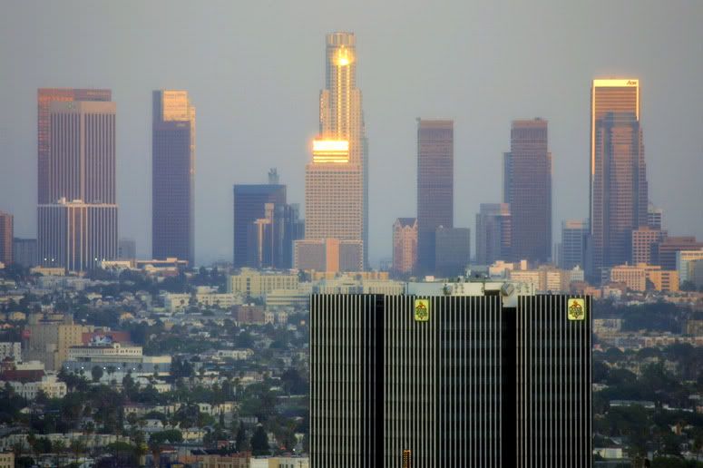
Behind the glass you have a town : L.A
First you have to know that the town was created on a separate document and added at the end behind Jensen thanks to the "Stamp tool". Here's the result just after using the "Stamp tool". It's not finished yet but you got the general idea. Don't pay attention to the colors on the left, it's my palette for Jensen's face. The image is flipped compared to the final result because I am right handed : it is easier for me to draw with the image turned this way, particularly Jensen.

The city is in fact a big patchwork between CG painting and photo paintover (yeah, I'm super lazy...). I used those reference pictures of L.A (here and here), redrew some parts, drew some elements from scratch that don't even come from L.A (San Diego) thanks to Painter and its fantastic "Chalk tool" to create a town that basically is L.A...without being LA. What was important was to built a coherent image, to give the impression it was actually one town and not several pictures put next to the other. It takes time, patience. You have to be precise particularly with the skyscrapers and, let's face the truth, it's boring.
Are you freaking nuts ?!!! Why creating a whole town with so many details if it's to make it vanish behind a window ?!!
Because at the beginning, in my first vision, the window should have been open and the title "The City of Angels" be a neon sign on the top of a building somewhere. I tried, it didn't work at all so I came up with a new idea, writing the letters "City of Angels" on a dusty window pane. If I had had this idea from the start, I wouldn't have wasted so much time drawing all the little details of L.A one by one, believe me. -____-
The sun is shining...but OMFG!! Did you use a lens flare ?!!!!!
Ok, FTR you have to know that I consider the "lens flare" like the cheapest effect available on Photoshop. For me it's really synonymous of "super-extra-cheap-photo-manip". However, you can use it sometimes, under precise circumstances and here is one..It's like Bon Jovi if you want : it rocks ON OCCASION. So, to create the setting sun, I added the "Lens flare", then faded it thanks to "Edit >> Fade "lens flare" ". I erased with the "History Brush" the circle around the sun itself and the halos spread all over the pic to just let the main light. I wanted the effect to be subtle. We are not in StarTrek or Battle Star Galactica where the sun shines like a supernova.
Creating the title : The City Of Angel
Creating that "writings on the window pane" effect is actually quite simple. It takes ten minutes top, one layer and two kind of brushes, one to paint, the other one to erase. We're also going to add some highlights.
1) First, we have to create the window itself. Create a new layer, set the opacity of your brush (basic brush) to 100% and the opacity of the layer to 30%-35%, depending on the effect you want to give and the background behind the window. For the color choose white (#FFFFFF) or a very pale pink like, for instance #F9D9D9. And now...just...paint !!

2) Now that we have a window, we have to create the title. Chose the eraser tool, with a "grunge brush" (see above, the brushes I used). It's easy to find one one the Net but if you don't have one, you can go for something in the "Dry Brushes" section. Set the opacity to 100% and just start writing : the eraser will make the white layer (the "window" one) vanish and the town will appear below.

3) To really give the impression that Jensen is in front of a window, we are going to add some highlights. Flatten the image, choose the "Dodge tool" set to "Midtones" with an opacity of 20% and just go for some big strokes on the window.
The final touch : Textures and filters
They are very important to create the "sunset effect". I first used a warming filter ("Image" >> "Adjustment" >> "Photo Filters" >> "Warming Filter") set to 70% then thanks to "Variations" I added "More yellow" and "More red". I faded the effect thanks to "Edit >> Fade "variations". Then I used the color balance to add "More magenta". Finally, I used a texture (this one) to give an "old photo" effect. Voilà !!!

That's it !!
Once again, sorry about my English -_______-
More questions ? DON'T HESITATE!!!
Just ask here on LJ or on FormSpring.me : http://www.formspring.me/PetiteMadame
The full size version is available here : http://img695.imageshack.us/img695/7646/cityofangelslj.jpg
GENERAL QUESTIONS
What's the concept ?
This is an illustration art for an AU RPF called Smoke and Lightning, Book III - The City Of Angels, written by Misses Bloodyadorable and EvilTwin. In this story, Jensen is a doctor so here's the guy after a day at work. And yes, he has a full sleeve tattoo on his arm. If you know a Md like this one, just give me the address of the hospital...
If you want to know more about Smoke and Lightning you can check :
1) The fic master posts :
- Book One (Complete) : http://community.livejournal.com/arealwildchild/9553.html
- Book Two (Complete) : http://community.livejournal.com/arealwildchild/27680.html
- Book Three (In Progress) : http://community.livejournal.com/arealwildchild/52119.html
2) Bloodyadorable's great photomanips on her Deviant Art page here :
http://bloodyadorable.deviantart.com/
3) My previous post devoted to a Jared- Smoke and Lightning fan art here : http://petite-madame.livejournal.com/1864.html
You will learn more about the story and why you should start reading particularly if you love bad boys with bikes and tattoos ;)
Ok, this is Jensen as he is described in the fic but he has something of...Dean, no ?
Actually yes..I can't explain exactly the reasons why. The general aura maybe, the moody attitude or just because of the reference picture I used. I think I am going to transform this fan art into a "Dean version" with a zombie or something which shows up behind the window and Dean holding a smoking gun. It's gonna be a lot of fun!! ^o^
Oh no...zombies again, you can't help it, can't you ?
No I can't...Next time, it's gonna be bloody. Two Spn fan arts one after the other without even one drop of blood is enough even if I really enjoyed creating those two pieces for S&L.
Funniest thing to draw ?
Even if 50% of it was a paintover (see below) the tattoo was a lot of fun to create. I really love the final result ^^
Most boring ?
The town. One day, like famous mangakas in Japan, I will have an army of slaves I will treat like shit and who will be paid only to draw sets and "mechas" such as cars (except the Impala), washing machines, guitars...Until then, I have to draw everything myself...
LET'S TALK ABOUT TECHNIQUE
What softwares did you use ?
Photoshop CS and Painter Essential 3, no Paint ProShop this time.
Tablet : Wacom Graphire 4
How long did it take you ?
More than 20 hours for that one I think, mainly because I am nuts enough to have created a whole town hidden behind a window...
OMG, 20 hours for a fan art..Don't you have a life or something ?
I do have a life but unfortunately for me I am a bit of an insomniac. I just can't sleep at night, sleeping 3 hours is already a lot for me. So I have two solutions :
1) Hanging out with the owls in the streets of Tokyo...Awesome...
2) Drawing, everything and anything, fan arts, comic strips, cute stuff, stupid self portraits, just to pass the time. That's more creative than staying in front of the TV watching Japanese TV shows where a guy pours boiling water on an another guy's butt.
What brushes did you use ?
Photoshop : Mainly default brushes from the "basic brushes set" (Opacity 30%-50%), a "dry brush" for the shadows and outlines plus a whole bunch of brushes downloaded on the net. Once again, I can't give you a precise link for every brush because I downloaded them ages ago but you can find very good stuff on websites such as Brusheezy or Deviant Art. However, here is a little glimpse at the main brushes I used in my drawing :
Painter : Acrylics, chalks and digital watercolors with a very low opacity.
Because Jensen is hot but Jensen with a tattoo is even hotter : creating the tattoo
In my latest fan art which was also an illustration art for Smoke and Lightning, I used a different method to create the tattoos : I used predefined brushes and added colors (See Let's talk about technique in my previous post, at the bottom of the page).
This time, I wanted more realism so I used a mix of paintover and predefined brushes. I used this reference picture from an existing tattoo, added the fish and the bottom of the tattoo on Jensen's arm thanks to the "Stamp tool" (with a layer set to "Multiply" with an opacity of 80%) and thanks to a predefined brush (see above), I "drew" the flower (in two clicks, ho, ho, ho ^^) next to the koi. I added some colors, highlights (mainly in pale blue), redrew some parts to give the impression it was one tattoo and not a patchwork of various sources et voilà!
Behind the glass you have a town : L.A
First you have to know that the town was created on a separate document and added at the end behind Jensen thanks to the "Stamp tool". Here's the result just after using the "Stamp tool". It's not finished yet but you got the general idea. Don't pay attention to the colors on the left, it's my palette for Jensen's face. The image is flipped compared to the final result because I am right handed : it is easier for me to draw with the image turned this way, particularly Jensen.
The city is in fact a big patchwork between CG painting and photo paintover (yeah, I'm super lazy...). I used those reference pictures of L.A (here and here), redrew some parts, drew some elements from scratch that don't even come from L.A (San Diego) thanks to Painter and its fantastic "Chalk tool" to create a town that basically is L.A...without being LA. What was important was to built a coherent image, to give the impression it was actually one town and not several pictures put next to the other. It takes time, patience. You have to be precise particularly with the skyscrapers and, let's face the truth, it's boring.
Are you freaking nuts ?!!! Why creating a whole town with so many details if it's to make it vanish behind a window ?!!
Because at the beginning, in my first vision, the window should have been open and the title "The City of Angels" be a neon sign on the top of a building somewhere. I tried, it didn't work at all so I came up with a new idea, writing the letters "City of Angels" on a dusty window pane. If I had had this idea from the start, I wouldn't have wasted so much time drawing all the little details of L.A one by one, believe me. -____-
The sun is shining...but OMFG!! Did you use a lens flare ?!!!!!
Ok, FTR you have to know that I consider the "lens flare" like the cheapest effect available on Photoshop. For me it's really synonymous of "super-extra-cheap-photo-manip". However, you can use it sometimes, under precise circumstances and here is one..It's like Bon Jovi if you want : it rocks ON OCCASION. So, to create the setting sun, I added the "Lens flare", then faded it thanks to "Edit >> Fade "lens flare" ". I erased with the "History Brush" the circle around the sun itself and the halos spread all over the pic to just let the main light. I wanted the effect to be subtle. We are not in StarTrek or Battle Star Galactica where the sun shines like a supernova.
Creating the title : The City Of Angel
Creating that "writings on the window pane" effect is actually quite simple. It takes ten minutes top, one layer and two kind of brushes, one to paint, the other one to erase. We're also going to add some highlights.
1) First, we have to create the window itself. Create a new layer, set the opacity of your brush (basic brush) to 100% and the opacity of the layer to 30%-35%, depending on the effect you want to give and the background behind the window. For the color choose white (#FFFFFF) or a very pale pink like, for instance #F9D9D9. And now...just...paint !!
2) Now that we have a window, we have to create the title. Chose the eraser tool, with a "grunge brush" (see above, the brushes I used). It's easy to find one one the Net but if you don't have one, you can go for something in the "Dry Brushes" section. Set the opacity to 100% and just start writing : the eraser will make the white layer (the "window" one) vanish and the town will appear below.
3) To really give the impression that Jensen is in front of a window, we are going to add some highlights. Flatten the image, choose the "Dodge tool" set to "Midtones" with an opacity of 20% and just go for some big strokes on the window.
The final touch : Textures and filters
They are very important to create the "sunset effect". I first used a warming filter ("Image" >> "Adjustment" >> "Photo Filters" >> "Warming Filter") set to 70% then thanks to "Variations" I added "More yellow" and "More red". I faded the effect thanks to "Edit >> Fade "variations". Then I used the color balance to add "More magenta". Finally, I used a texture (this one) to give an "old photo" effect. Voilà !!!
That's it !!
Once again, sorry about my English -_______-
More questions ? DON'T HESITATE!!!
Just ask here on LJ or on FormSpring.me : http://www.formspring.me/PetiteMadame

no subject
Date: 2010-09-29 07:15 pm (UTC)Your talent and creativity simply astounds me! Thank you for sharing all this amazing art and useful info with us! <3
no subject
Date: 2010-10-01 11:10 am (UTC)Apparently you saw most of my illustration arts for fics. I worked on Next Man Up, The Smoke & Lightning Verse and Beautiful Disaster. The next one will be "The doors of Time" by Felisblanco but ATM I am busy because of the Reverse BB challenge ^^
My Master post isn't complete, I started to update it about 2 weeks ago but unfortunately, I didn't finished!
Thx again :)
no subject
Date: 2010-10-02 01:08 pm (UTC)no subject
Date: 2010-10-04 03:08 pm (UTC)Hum...more than "a piece" actually, "pieces" would be more correct ^^;; Unfortunately, I had to drop (momentarily) "The doors of Time" because of the Reverse Bang but as soon as the RBB is finished, I will finish this project because I really enjoyed this fic! A lot a people found it "schmoopy" but I don't agree, it's really beautiful. If you have the time, just don't hesitate ♥
Thanks a lot for the great comment about my art, glad you enjoyed my DA page and my LJ ♥
no subject
Date: 2010-10-05 11:04 am (UTC)Keep up the wonderful work! <3
no subject
Date: 2010-10-07 04:48 pm (UTC)Thanks a lot for the cheering ^^